Saturday, December 8, 2012
Thursday, November 29, 2012
Blog Entry 16 – Magazine Spreads
 |
| This is a successful spread because it contains an important quote of the article. Also the columns are lined up nicely and a subheading is used to change topics. |
 |
| This is successful because the columns are lined up nicely, a subheading is include in change of topic, and the dialog box describes the pictures. |
 |
| I like this spread because it works around the picture at the bottom of the page. New topics are easily distinguished by the bold at the begging of the new paragraphs. |
 |
| This is a neat spread because the columns are aligned with the pictures nicely. The break of the columns to describe the camera is also nicely placed. |
Tuesday, November 27, 2012
Friday, November 9, 2012
Thursday, November 1, 2012
Blog Entry 13 – Project 2 Research Sketches
The business I came up is called Cianci's Donuts by the Beach. I was thinking of calling it something else, maybe along the lines of Cianci's Shore Donuts, but I feel like by the beach sounds more fitting. I came up with this idea because every year we go on vacation, my dad and I always talk about how we should open up a donut shop near the beach because there really isn't many of them around. I feel like I can represent this business as the designer because I'm in the process of making a logo that will really stand out to customers.
Thursday, October 25, 2012
Blog Entry 12 – The Non-Designer's Design Book: Type Categories
 |
| This is an example of modern type face because it has a striking appearance to it. |
 |
| This is script type face because it flows together with each character very well. |
 |
| This is a good example of slab serif type face because the serifs are literally slabs and there is very little thick to thin transition. |
 |
| This is a great example of sans serif type face because there are no serifs anywhere and the thick to thin transition is non existant |
 |
| This is decoration type face because the font has nice little decorative features in and around it. |
Tuesday, October 23, 2012
Blog Entry 12 – The Non-Designer's Design Book: Type Categories
 |
| This is an example of concord text type because it is all the same size, color, and font face. It is also very repetitive. |
 |
| This is an example of conflict text type because there is so much going on here with different colors and sizes that you can't focus on just one thing. |
 |
| This is another example of concord text type because the main thing you look at is all plain and the same looking. |
 |
| Another example of conflict because you can only make out a few examples of words because everything is literally in 'conflict'. |
 |
| This is a good example of contrasting text type because it forces your eyes onto the people getting married and you move your eyes from there. Everything on here is very exciting. |
 |
| Another great example of contrast because the title of the book is much bigger and at a brighter color than the rest of the cover, forcing your eyes to it first. |
Sunday, October 21, 2012
Blog Entry 10 – The Non-Designer's Design Book: Alignment
 |
| This shows right alignment, where the text ends at an imaginary line on the right side. |
 |
| This shows an example of how bad alignment can make a business card, or anything else for that matter, look terrible. |
 |
| On the other hand, this business card shows how good alignment (left alignment) can make a business card look great. |
 |
| This is a good example of alignment because the second line matches up with the first line quite perfectly. It allows for your eyes to make a smooth transition from line to line |
 | ||||
| Although there is alignment for the text, it is aligned in quite a way that is cool. They matched the letter 'O' together to create the effect of OO7. |
 |
| This is a great example of alignment because there is an invisible line on the left and right side of the text, making it look very professional and smooth. |
 |
| There is no alignment here what so ever, everything in this typography image is cluttered and doesn't have any relation to each other. |
Thursday, October 18, 2012
Sunday, October 14, 2012
Blog Entry 8 – The Non-Designer's Design Book: Proximity
 |
| This movie poster for Jurassic Park really displays proximity because the way the title is placed in the middle and then the actors/director of the movie in a different color and placed away from the center. |
 |
| Each category is easily distinguished from one another because of the bold blue title. Without the title, it would all be one mess |
 |
| The name of the restaurant and sponsor is located away from the main attraction, the Baconator, and placed together. The name of the sandwich is in yellow to draw your attention to it quickly |
 |
| The design of this business card is great at showing proximity. The title of the company stands out from the rest while the his name and his contact info are easily separable from each other. |
 |
| This book cover has the title Grow Rich in white letter to draw attention to what people want the most, money. |
Thursday, October 11, 2012
Blog Entry 7 – Project 1: Revised Image Final
Monday, October 1, 2012
Sunday, September 30, 2012
Blog Entry 5 -Project 1: Research
Miss Aniela
I think the way the artist tries to incorporate a lady in a dress in every scene is very interesting. She seems to have a lot of self confidence in herself also because her about me section says she does a lot of self portrait work and most of her self portraits contain her in the nude. I noticed her work is also dark, which fits in with her style pretty well. I feel like if I studied more into her work, each image has it's own back story to it and they would be pretty interesting.
Jerry Uelsmann
His work is in all black and white which is something I like to see. It lets me focus on the entire image other than just a part where the vibrant color makes you focus. His work seems to flow very well for this reason. Some of his work is very complex, while others aren't. One piece that stuck out to me was the one with the boat in the sky. Clearly him and I have the same thoughts that the sky is just like water at times.
Wednesday, September 19, 2012
Saturday, September 15, 2012
Wednesday, September 12, 2012
Sunday, September 2, 2012
Blog Entry #1: Photo-Based Design Interaction
 |
This picture of the air freshener shows that, with the picture of the flower and pineapple, that your room will smell like a Hawaiian Breeze. The colors also show a tropical feel to the can.
The blue background and the ice cubes on this pack of gum shows the type of sensation you will receive when chewing the gum. The flavor of the gum, Polar Ice, also indicates that you will have a cool and minty flavor burst in your mouth.
The picture of the fish in the logo shows an example of what kind of fish you can catch if you shop at Bass Pro Shops. The yellow background and the red lettering indicate an outdoors type of store
In this magazine excerpt it shows the Michelin man throwing tires at a car with bad tires while in the rain. You could see the driver looking concerned, but as the passengers see the new tires being thrown onto the car they get a sense of enjoyment.

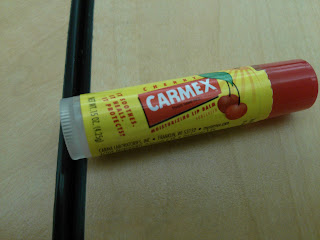
The flavor of this lip balm is shown easily by the picture of the cherries and the red cap. As said on the container, it soothes, it heals, and it protects; everything you want with a lip balm
Subscribe to:
Comments (Atom)


